Understanding How Students Make Sense of Misleading Graphs
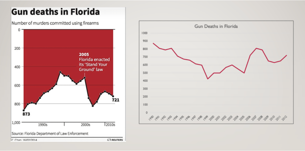
Graphs and data visualizations are everywhere – in news articles, social media feeds, political campaigns, and public health communications. But not all graphs tell the truth. Some are designed, intentionally or not, to mislead viewers by distorting the visual representation of data. A truncated y-axis, an inverted scale, or a manipulated interval can make small differences look dramatic or large trends appear negligible.
Most research on misleading graphs has focused on a straightforward question: can people spot the distortion? The findings are sobering. Studies show that the vast majority of people; including educated adults and even PhD students in quantitative fields are systematically misled by distorted graphs.
But my research asks a different question: does it matter what you already believe about the topic the graph is depicting?
When a graph’s message aligns with something a viewer already thinks is true, do they engage with it differently than when it challenges their existing beliefs? And when a viewer is skeptical of a graph’s message, does that skepticism help them think more critically?
My study explores how undergraduate students interact with misleading graphs on socially relevant topics, examining the role that prior beliefs, and positionality play in shaping how they read, interpret, and respond to distorted data visualizations. This work has implications for how we teach data literacy in an era of widespread misinformation, and for how we think about what it truly means to be a critical consumer of quantitative information.
